In terms of building the actual website, I of course initially started by planning the ux design of all the separate pages. I did this traditionally in a sketchbook and you can see so in figures 1 through to 4 which display the different pages and layouts I will use and where everything will be placed. When building the website, I started off by creating all of the assets separately. I did this with a variety of different software such as ‘Procreate’, ‘Photoshop’ and ‘Illustrator’. Assets such as the logo, banner and images of artists were made in ‘Adobe illustrator’ whereas most of the decorative illustrations and most of the portfolio art was made on ‘Procreate’ I wanted to focus on the assets first as opposed to the design and build of the website itself so that when blocking all of the elements I could fill up every space straight away.
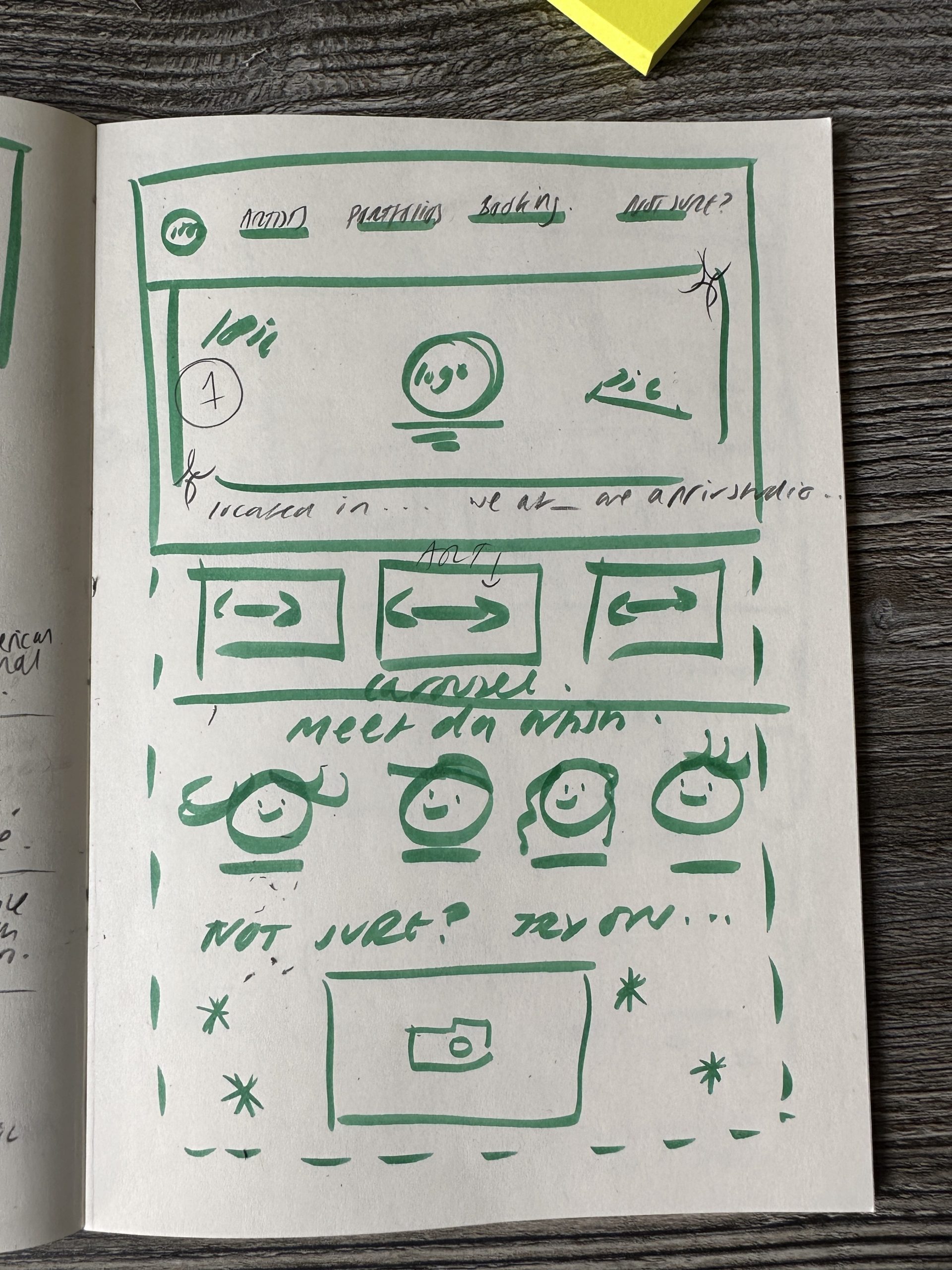
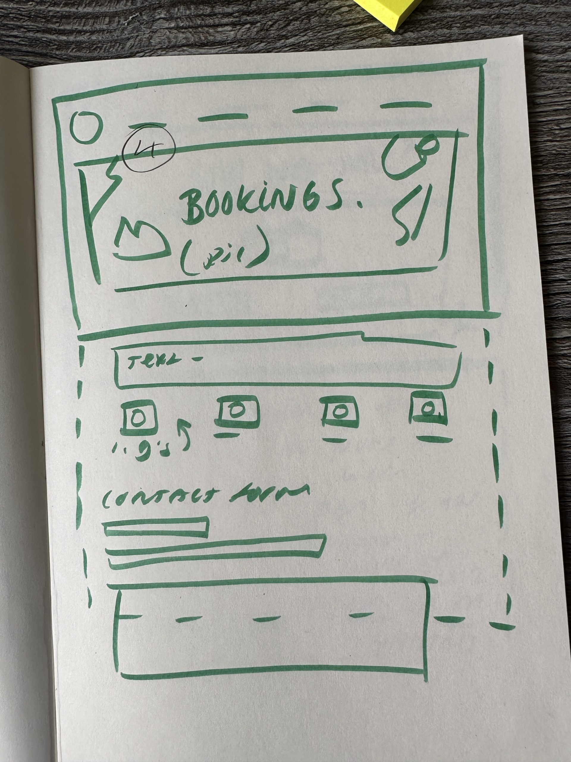
I started by blocking out the homepage fully so that it was the right format and finalised. I did this so that I could copy and paste things like the top menu and logo to each page without having to redo it every time and keeping it all the same. I had to learn how to link new ‘Elementor’ posts together but once I had figured this out, the user experience journey became very easy to map out and so did each of the separate pages. When mapping the website out, I had to make sure that simple repeating assets such as spacers, dividers and colours were the same size on each post, I had to be very precise with this and ended up eventually screenshotting the features of each repeating image so that I could refer back when working on a new post. Once I had mapped out the key features of each page, the main work was working on the text and content to fill each element.
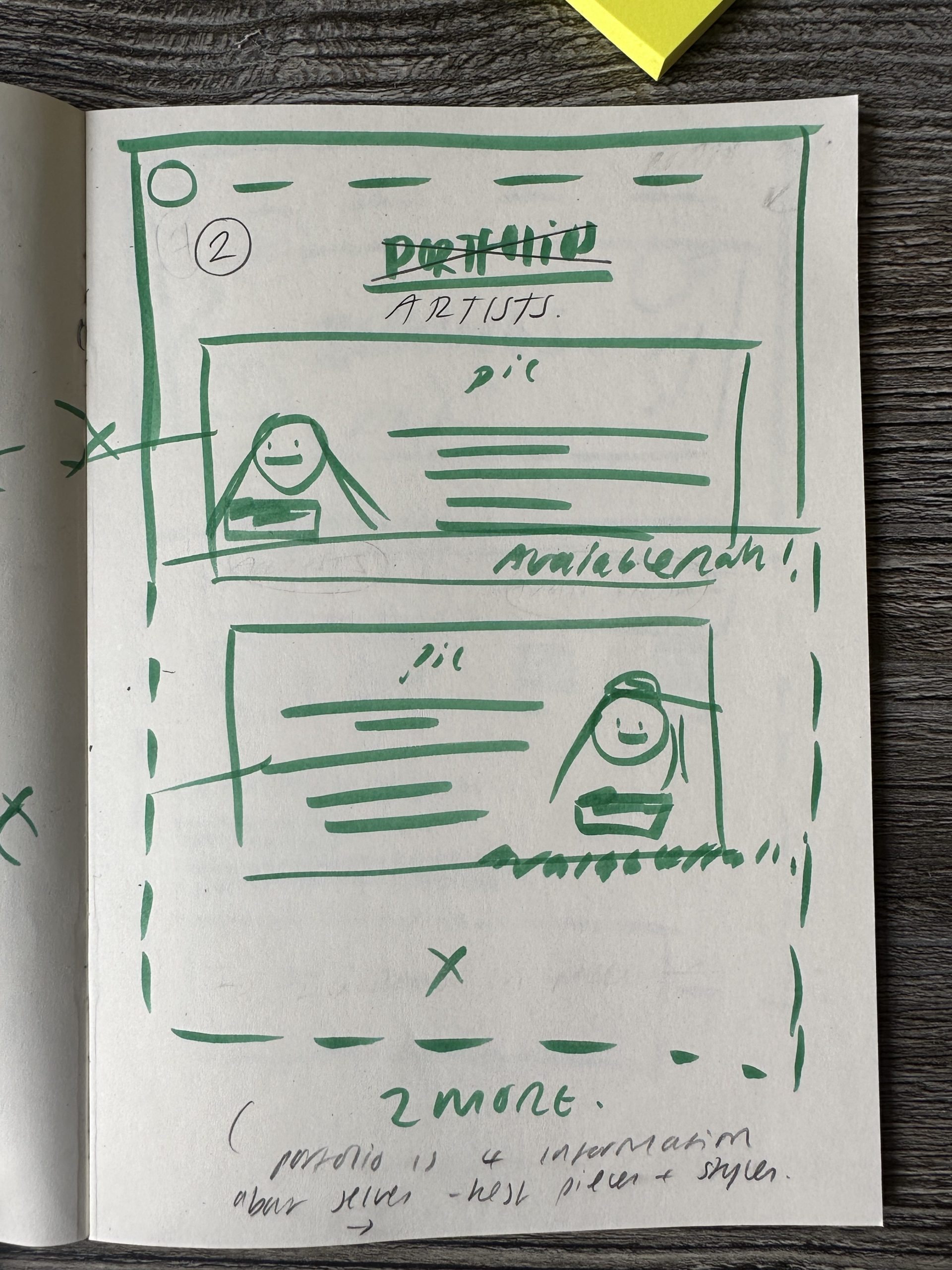
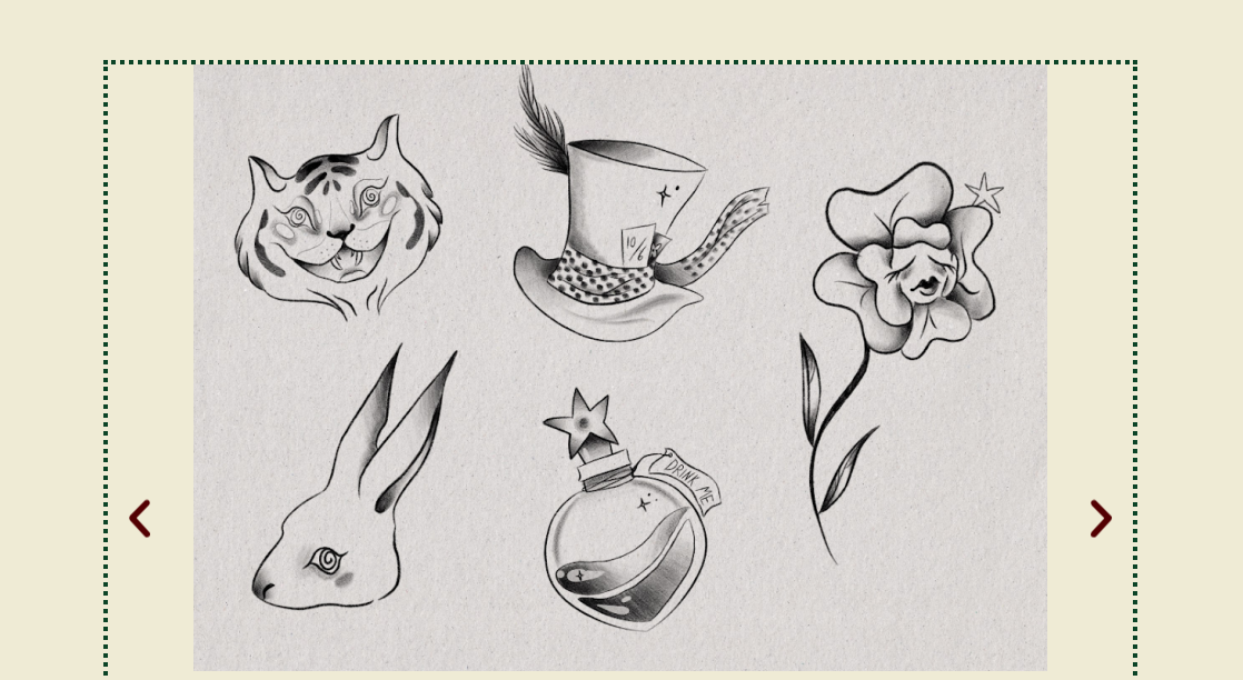
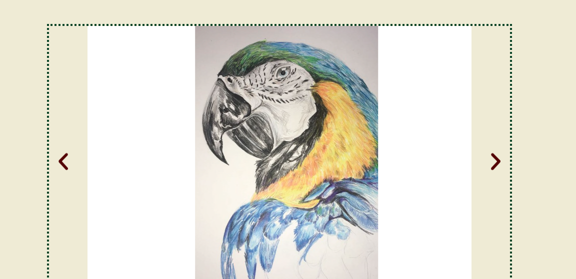
When building the portfolio pages, I wanted to keep all of them in a similar layout and built with similar elements. For example, each portfolio contains the same image carousel and new flash sheet detail. I did this to create a sense of harmony and similarity throughout the website and portfolios. The portfolios themselves each contain 4 different drawings, some being flash sheets made up of multiple separate tattoo designs I did this to show diversity and also to show my technical skill in terms of experimenting with different art styles. With the artists text introductions I also ensured to illustrate different personalities as to reach a wider audience, doing so means that the client looking to be tattooed can search through a website and get a feel for which artist best suits them thus creating a sense of trust and safety associated with the studio. As you can see in figures 5-6 these are just a few examples of illustrations and designs from the portfolio pages, you can see that the layout remains similar with each one, but the tattoo designs themselves create differentiation between the artists.
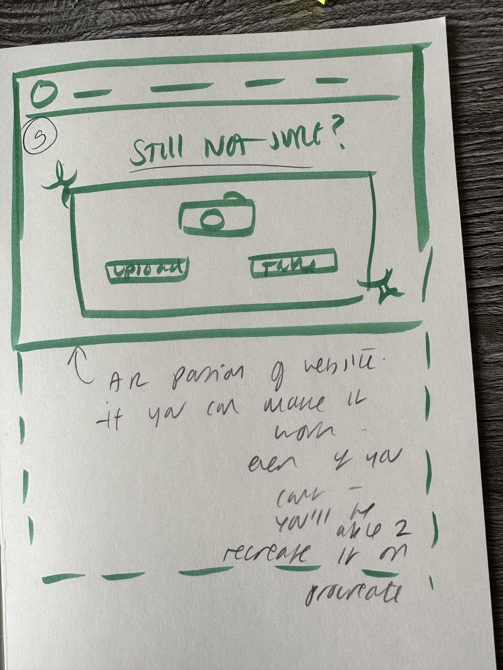
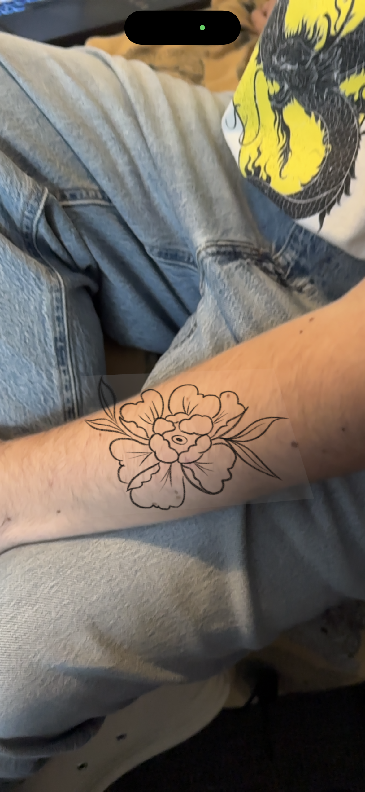
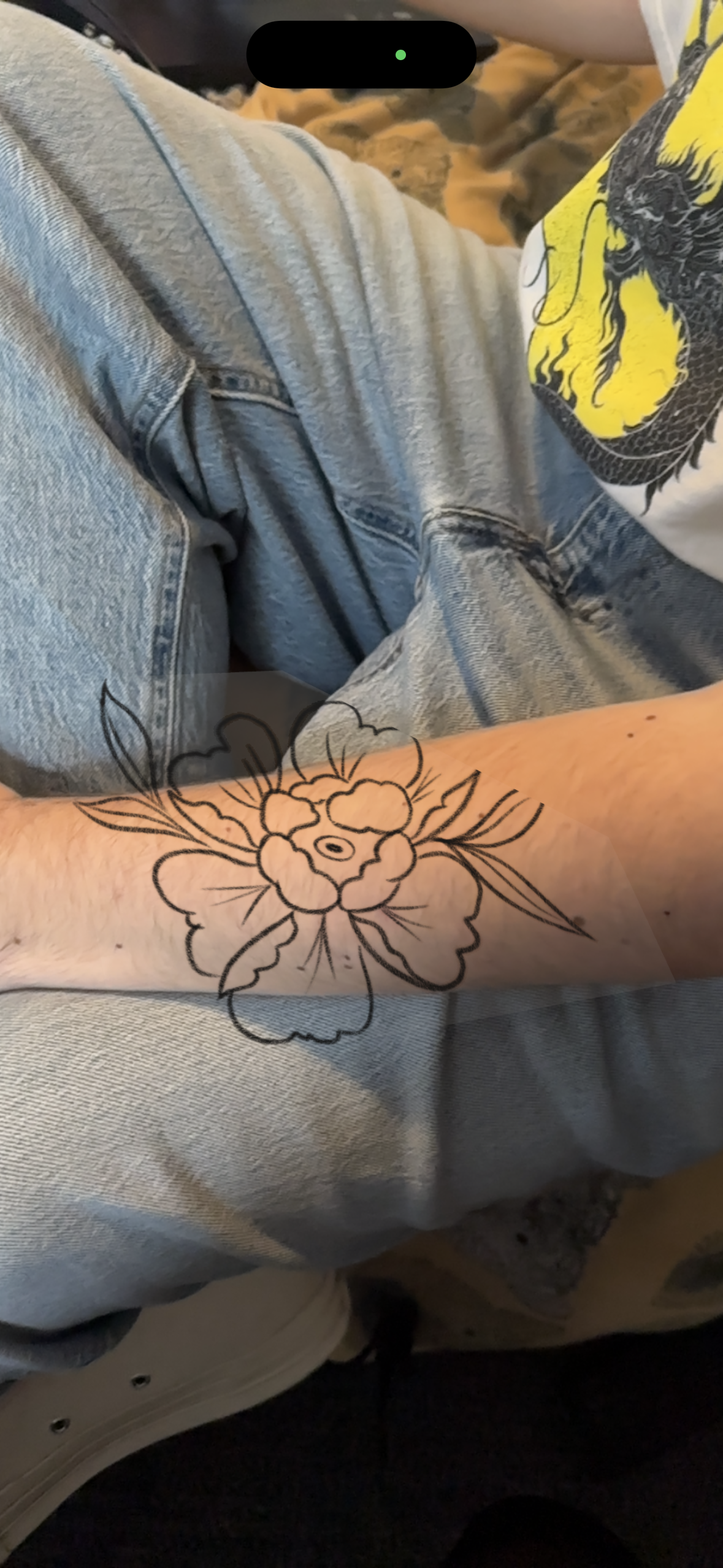
The AR feature on the website required the most thought. I had to think very carefully how I wanted the AR feature to look. I started by planning the initial pages out and what I wanted the user experience to be – similarly to how I planned the website layout itself. I did end up experimenting with trying to create working AR by using GLTF files made in blender and added into a WordPress plugin called ‘AR model viewer’. However, I ran into a lot of issues with this and as you can see in the figures below – the AR is not advanced enough to create a perfect effect just yet as it needs to be projected on to a flat surface, and the human body is not a flat surface. I did however find the experiments interesting and they also helped me to figure out how the AR page would look on the website – I thought I would discuss these experiments here as they did influence my design decisions in terms of the pages. You can see the product of these experiments in figures 7-8.
The final product of this website is available to look through via this development log on the post titled ‘HOMEPAGE’ for you to have a browse through.