The first thing I worked on fully developing was the branding of the studio itself. Most tattoo studios rely heavily on their artists and their tattoo styles to create the brand, but for this project I want to make sure that the studio itself has clear branding so that was the first thing I focused on.
I started by making a name and identity for the studio which I decided would be ‘Cherry’s’ as if the owner and head artist’s name was ‘Cherry’. I did this to aid in establishing a brand for the studio as the name ‘Cherry’ is a lot more memorable than a standard given name. A lot of tattoo artists do end up choosing their own name so it is easier to brand themselves and also perhaps separate themselves from their work life. Because of the name being Cherry I decided that the brand should have a red and green colour scheme, the website will reflect this too. I also wanted the studio to feel forward thinking and innovative and this will be reflected in the augmented reality feature as well as being a female owned studio.
To finalise the branding for ‘Cherry’s tattoo studio’ I am going to create a brand sheet to get my ideas into place. But before I attempt to finalise any design feature, I will experiment greatly with logo sketches and typography. I have already started this process by creating multiple sketches, mind-maps and writing some ideas down, some of these notes were illustrated on paper and some will end up being finalised in ‘Adobe illustrator’ which I will discuss and show in further detail below.
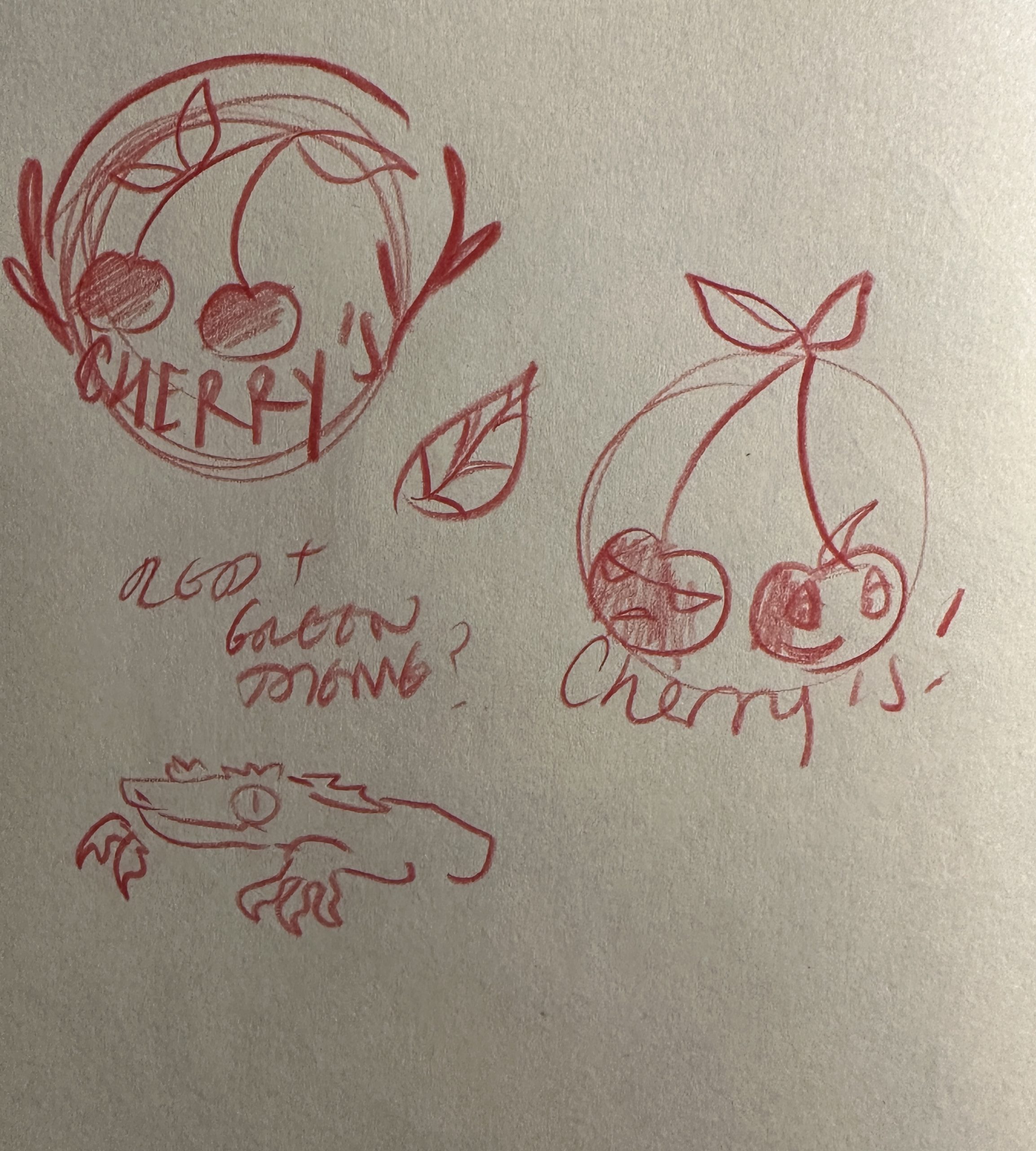
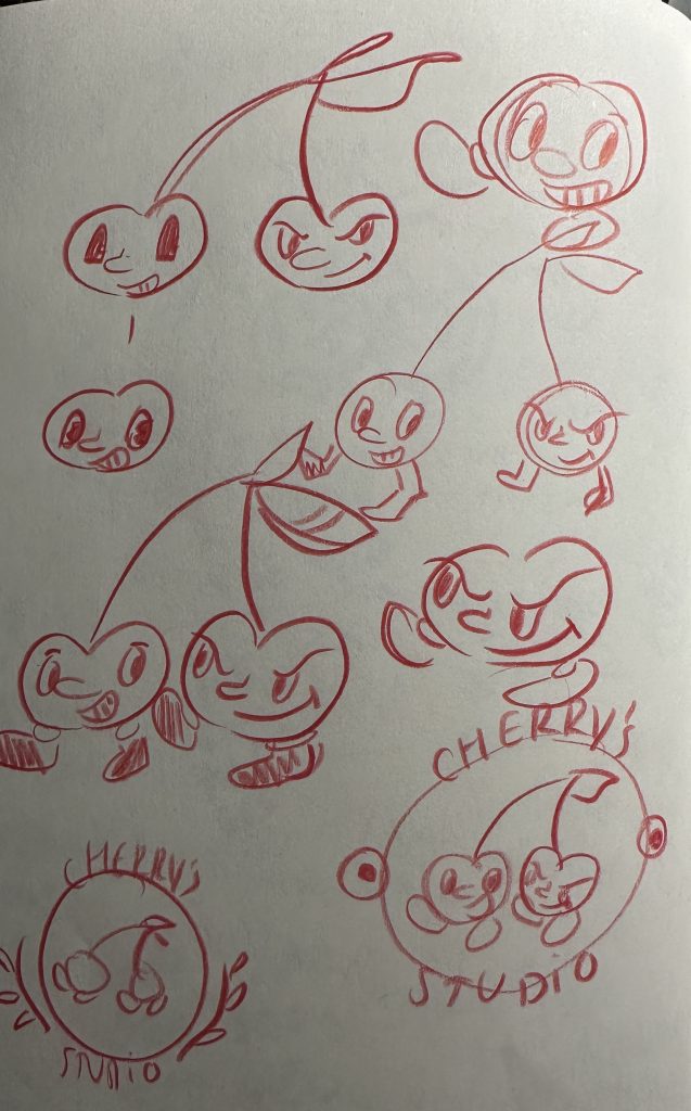
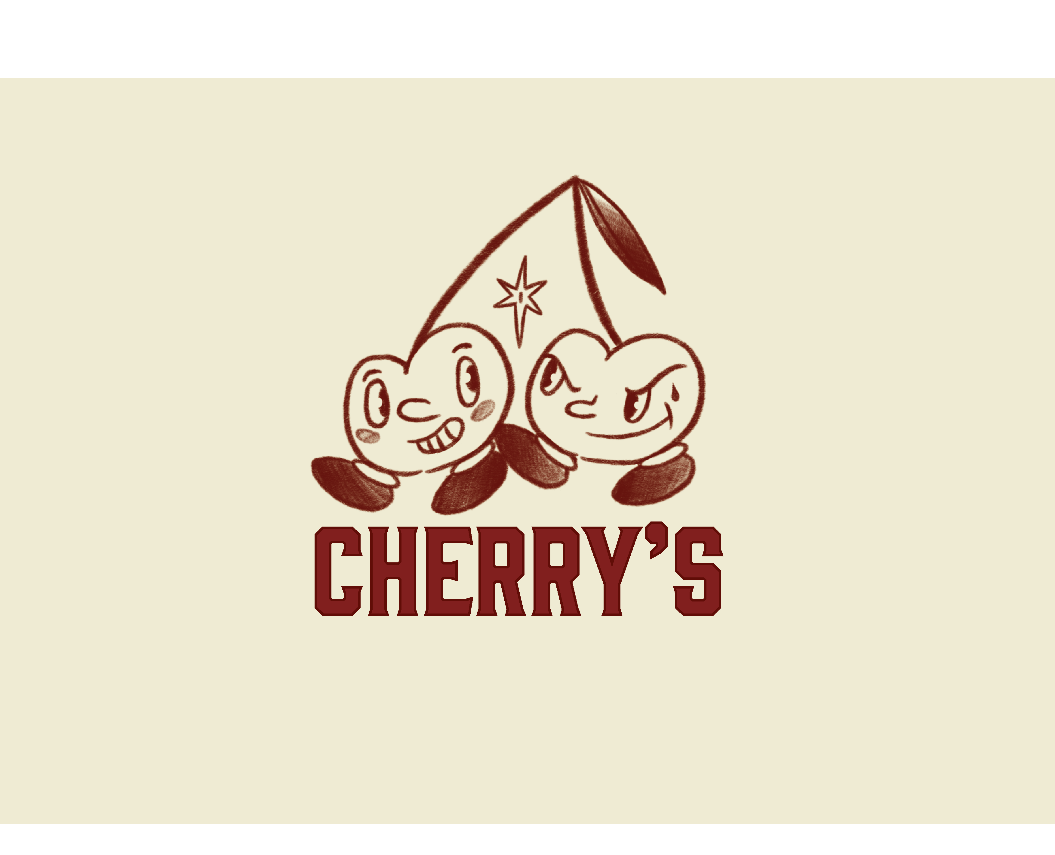
I initially started by focusing on the creation of the logo so let’s first have a look at the logo designs. In figure 1 you see the initial Cherry’s logo sketches, and as much as I thought this would end up being a compelling and finalised logo, I realised early on that it needed something extra in order to really create a memorable brand. Because of this, I looked into classic recognisable and popular logo designs. I quickly realised that a lot of popular logos feature a character of some kind, this is perhaps because according to research completed in the early 2000’s: the use of cartoon characters in branding creates more positive consumer attitudes towards the brand (Heiser, Sierra and Torres, 2008) because of this I chose to go with the iconic and recognisable cartoon ‘Rubber Hose’ style of the original ‘Betty Boop’ and old 1930’s animations to create the initial sketches you see in figure 2. Once I had sketched and finalised my idea I then imported it into procreate on the IPad where I finalised the sketch and then to Illustrator to add text and group the logo together. Figure 3 illustrates the final logo design created.
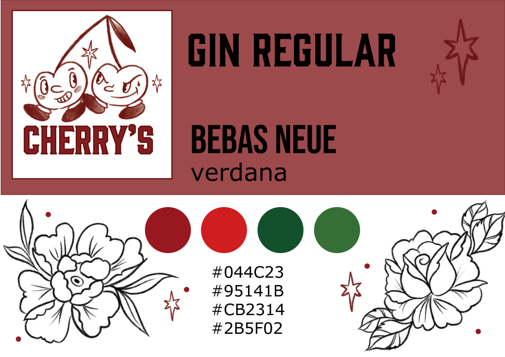
Once I had finalised the logo, it was time to focus on features such as the fonts I will use and the colour scheme. As written earlier I have already chosen a red and green colour theme for this brand, and as you can see below when experimenting with fonts I decided pretty quickly on the final fonts I wanted to use. I then started to experiment with different fonts and colours as well as motifs and small decorations for the website itself. When I was happy with how these experiments were looking and had decided on the fonts I will be using, I was able to combine them into a final brand sheet with everything organised as you can see in figure 4 , overall I am happy with how it turned out and will discuss some of the specific meaningful design choices I have made in a separate blog post.
REFERENCES
Heiser, Sierra & Torres. (2008) Creativity Via Cartoon Spokespeople In Print Ads: Capitalizing on the Distinctiveness Effect. Journal of Advertising. Available online: https://www.researchgate.net/publication/250174070_Creativity_Via_Cartoon_Spokespeople_In_Print_Ads_Capitalizing_on_the_Distinctiveness_Effect [Accessed 10/05/2023]
Spark. (2021) Why do brands use characters to help drive engagement and does it work? Available online: https://sparkemotions.com/2021/07/28/why-do-brands-use-characters-help-drive-engagement-and-does-it-work/ [Accessed 10/05/2023]