In this blog post I will analyse the experiments I have created in preparation for the full advert. Whilst planning, I had to contemplate how I would utilise visual effects to make an aesthetically pleasing and meaningful film. I experimented with a few ideas to make sure that I would be able to execute the advert exactly how I had planned.
The first thing I experimented with was the style of the advert. I edited photos that resemble camera shots in my storyboard to see how I wanted the final product to look. I did this by importing photos into Procreate and drawing on top of them. I was really happy with how the final images ended up looking, they were intense enough to send a message but not scary enough to be inappropriate for an advert designed for TV. I was also extremely happy with the style of illustrations and how they looked on top of images from real life.
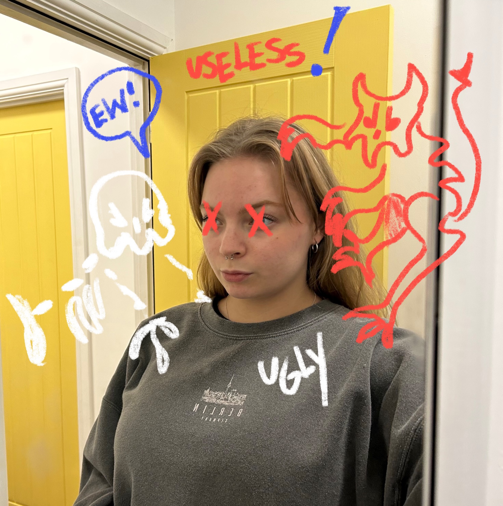
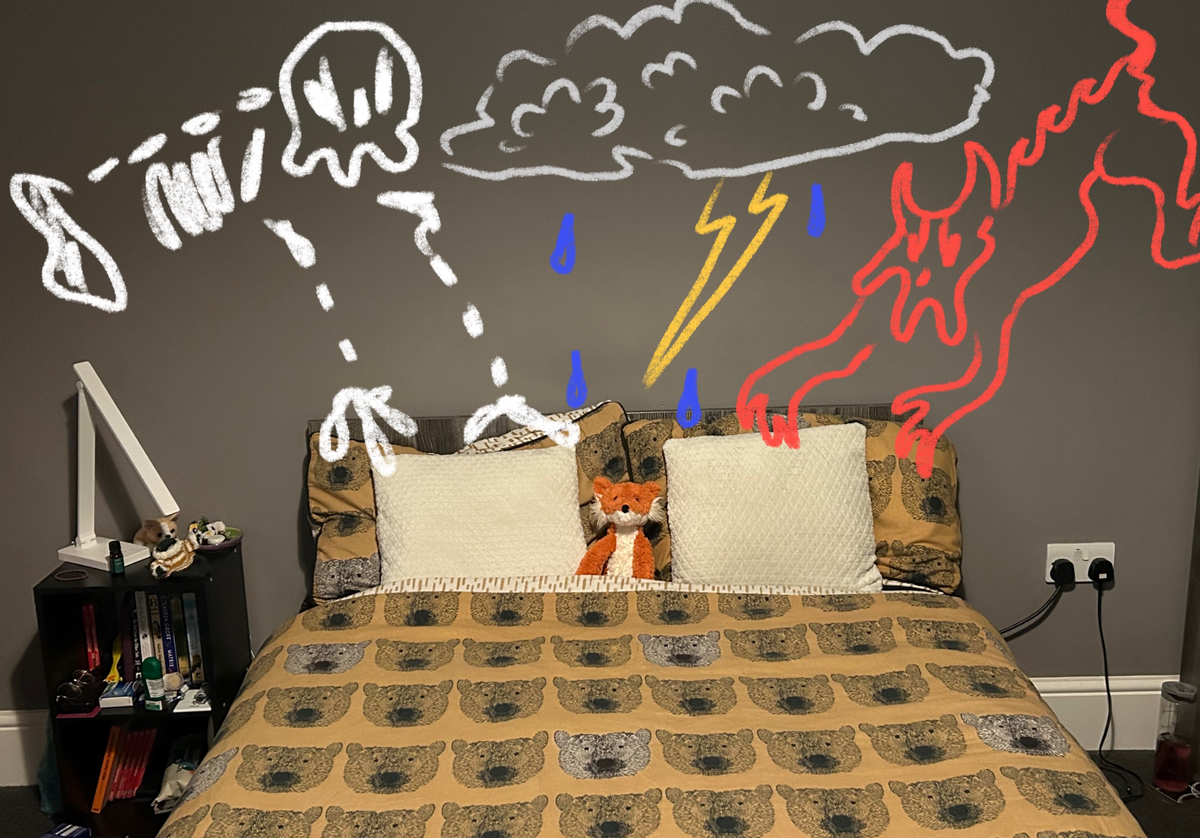
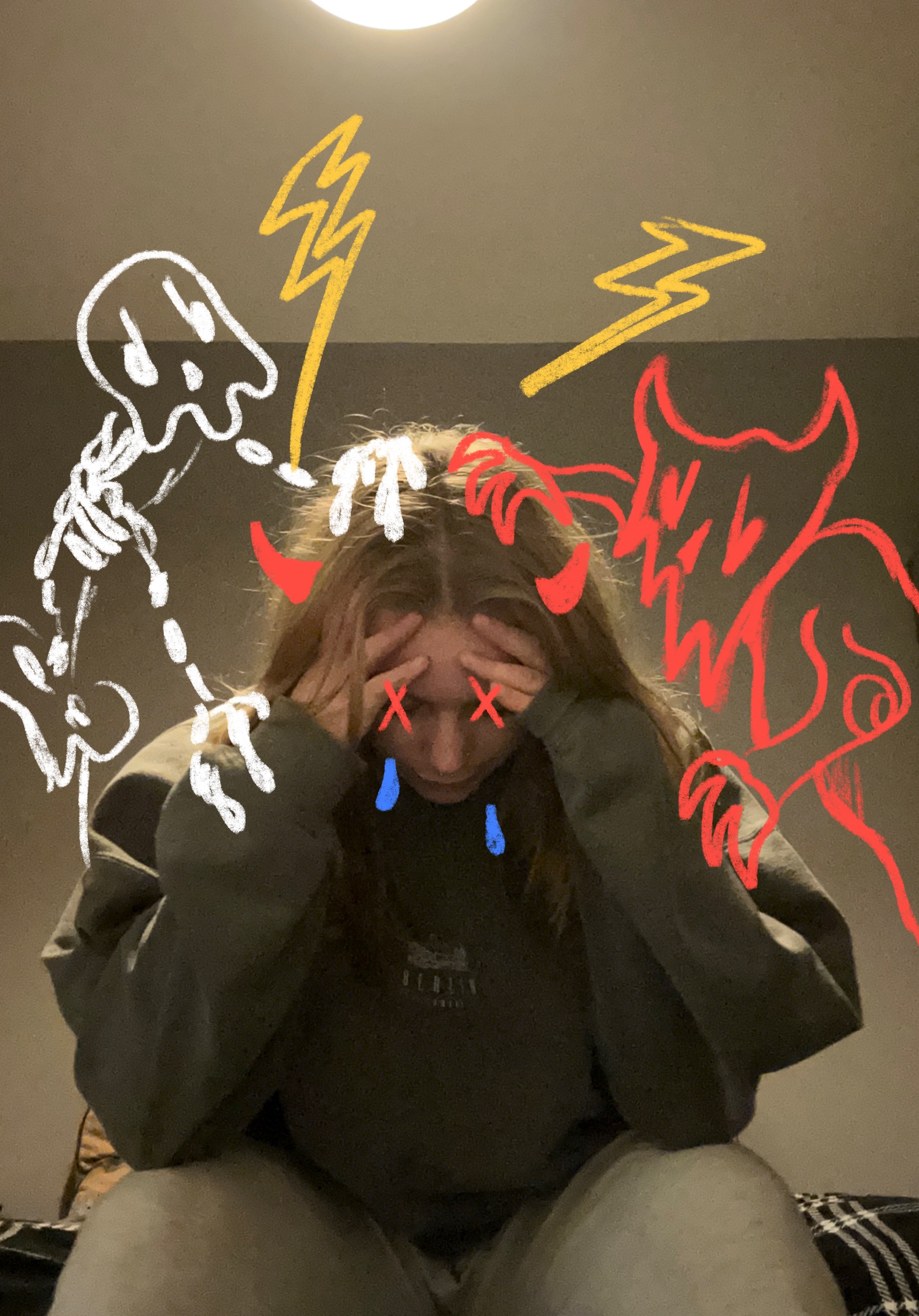
In the style experiments I made a few artistic decisions such as using certain colours for my creatures. I decided on red for the devilish character as red can be a symbol of “aggression, dominance and strength” (Melling, 2019) I thought this would be a good metaphor for how anxiety can feel dominant and aggressive in our lives. The other skeletal character is white as this could be seen as “stark, cold and isolated” (Cherry, 2022) again resembling how OCD and anxiety can convince you that you are alone.
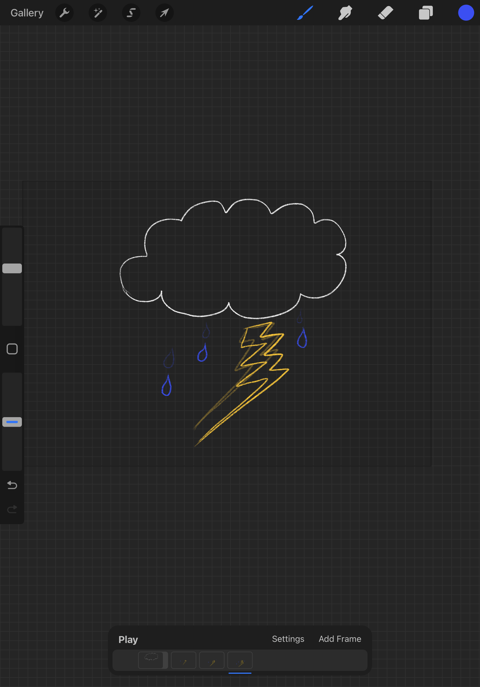
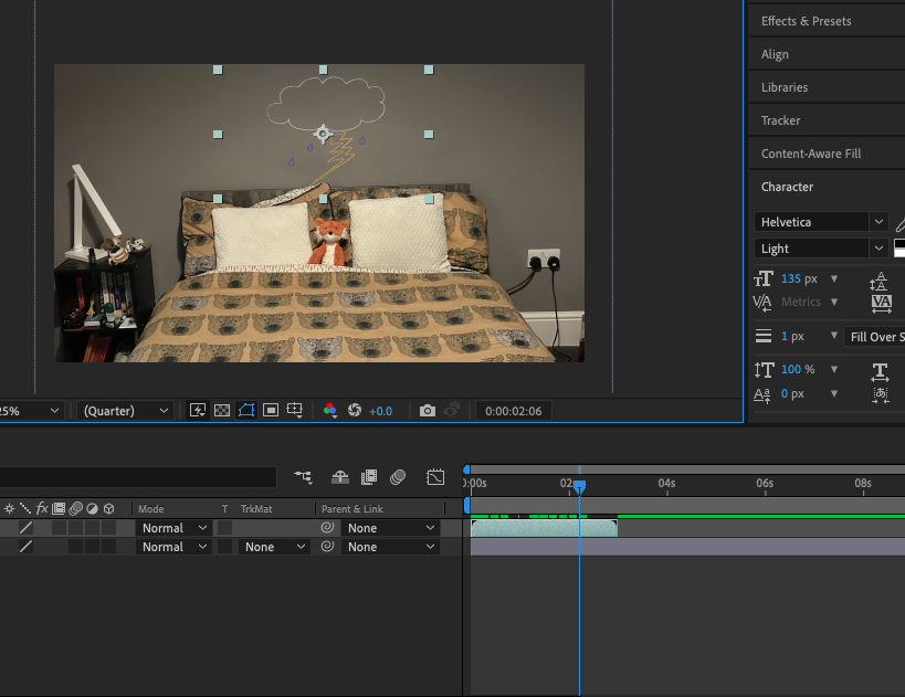
After deciding on the style I started to experiment with creating animated gifs and adding them on top of photos in After Effects. I did this by creating an animation in Procreate then exporting it as a gif and adding it into the project bar in After Effects. Doing this gave me an idea on how I would ultimately bring together my final advert and it ended up working quite well. The main issue I can see having in this process is the opacity of the gifs, which I will make sure to avoid by darkening my colours and going over illustrations a couple of times in the animation process. I also think that lining up the animations over live video might end up being a little tricky and will take some patience. Overall though the experiments proved that combining gifs onto footage in after effects will be a simple enough process.
Although the final experiment product is only short, it ultimately helped me in my planning process as now I know what I will have to do in order to create the final advert. I am happy with the final experiment and I am excited to start planning the camera techniques and filming process.
REFERENCES:
Cherry, K. (2022) The Meaning of the Colour White – colour psychology of white. Available online: https://www.verywellmind.com/color-psychology-white-2795822 [Accessed 6/1/2023].
Melling, E. (2019) Colour Theory – The hidden meanings of red. Available online: https://yesimadesigner.com/color-theory-the-hidden-meanings-of-red/ [Accessed 6/1/2023]