‘Air’ is a magazine that teaches others how to use art as a form of self care. It is aimed at young adults and teenagers struggling with mental health issues. In my project, colour plays an important role. I have chosen to stick to a set colour palette for my magazine as “brand colours are powerful in helping customers decide whether or not they want to engage.” (Marshall, 2021). My colour palette consists of light tones of blue, peach and brown. I chose these light colours as they are comforting and not intimidating. I also chose to use light blue heavily as it can be linked with the element of air.

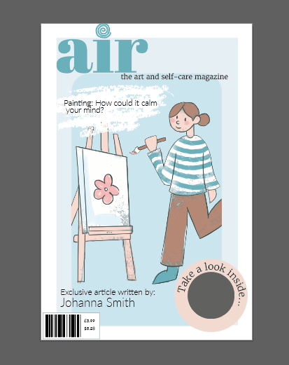
Edward Tufte suggested that colour could be used to enliven (Tufte, 1990, pp. 81-96) In this case, I have used colour to bring my illustration and the whole magazine to life and also create a brand. The colour could also be said to label the character as the colours all represent true reality (skin colour, hair colour etc.)
References:
Canva, 2021. How to choose the right colours for your brand. (Article) [Online] (Update unknown) Available at: https://www.canva.com/learn/choose-right-colors-brand/ [Accessed 5 January 2022]
Tufte, E.R., 1990. Envisioning Information. Cheshire (CT): Graphics Press.