Experimenting with shapes and imagery for my poster
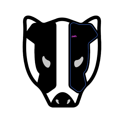
One of the key images of my poster is the badger and I wanted to focus on this first. I used the pen tool with my mouse to draw everything in this post. I knew from the beginning that I was attempting to create a modern looking poster with an up to date illustration style. I looked at references of badgers to make sure that I got the key shapes right. This is how the face turned out:
After I had completed the face I created the body, again using reference images to get the colours and shapes correct.
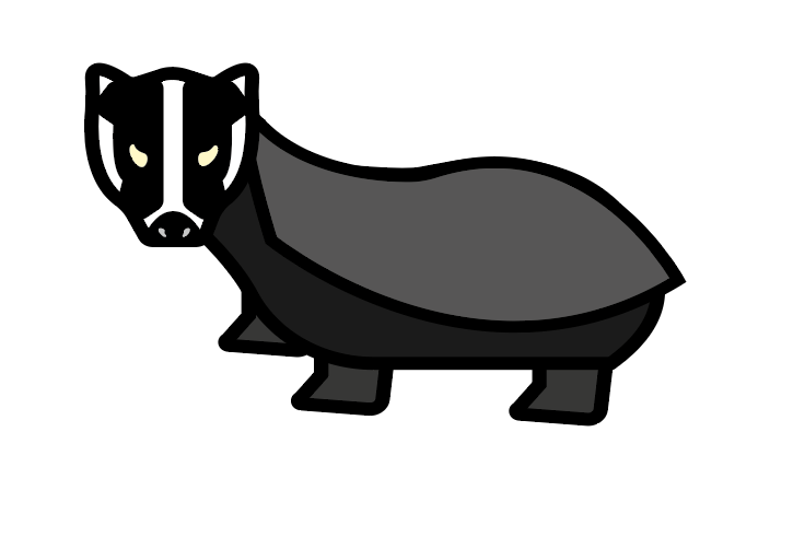
Overall I was happy with how the badger turned out, there are a few things I would change if I was to do it again, I would decrease the line thickness as it doesn’t match the style of the other illustrations and I would work on the shape of the body more.
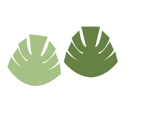
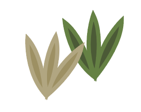
Then I drew some plants for the side of the road in my poster. I was really happy with how these turned out, I used copy and pasting and the transform tool to reflect the shapes how I wanted. I think I will end up using these in my final poster.
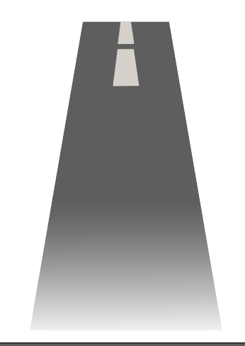
Then I started experimenting with how to make the road. It ended up being a little more difficult than I thought, but with the use of gradients and experimenting with the shapes, I managed to create a good outcome. I think this works as a road, if I were to change anything I would make the lines in the middle of the road smaller to create the effect of driving, however I am happy with this as a first attempt.
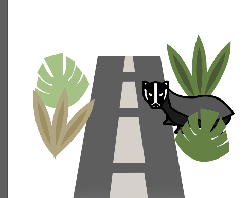
This is the final image. In this I grouped the images together to create a scene and make sure that they looked good together.