Analysing design choices.
https://www.horoscope.com/us/index.aspx
This is the website that I analysed. This website offers free horoscopes, zodiac and tarot readings. Their audience will presumably be spiritual people, the age and gender are so variant that the designs must be universal and acceptable to a multitude of beliefs and people.

The logo itself is a modern bold font. The bold typeface allows the logo to use the same gradient colour palette. The type is simple and modern perhaps to appeal to a new or more modern audience. The different shaped counters (moon, heart and star) allow the logo to tell you more about the website. For example many people check their horoscope for romantic purposes – this is probably why they chose the heart and of course the moon and stars relate to the positioning of the zodiac constellations in the sky.

The colour palette is interesting. The use of the warm toned sunset colours in a gradient may be replicating the sunset before the night sky when constellations are read. This could perhaps be showing that the users horoscope is about to be revealed like the night sky after a sunset. The gradient is also a very modern design choice. Ombre’s and gradients have become popular within the past few years – this may suggest the website is attempting to appeal to a more millennial audience.

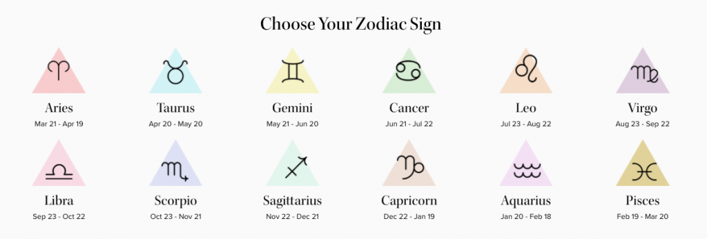
The illustrations used are clean and simple. The imperative text above the symbols entices the user in – the idea of having ‘your own’ zodiac sign and corresponding pastel colour triangle may be exciting and intriguing to a newer audience. The triangle symbol is also an astrological symbol. ‘The grand trine’ appears on a star chart when three planets are the same distance from each other – creating a triangle which symbolises complete harmony. This use of the triangle motif therefore also entices more experienced and knowledgeable astrologers.