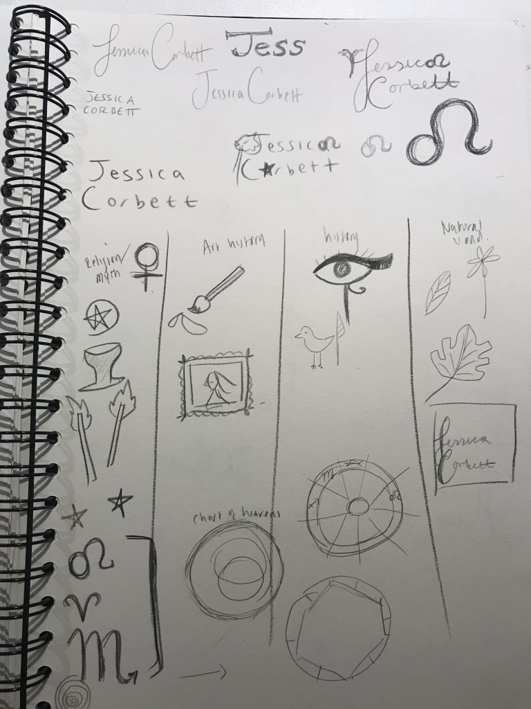
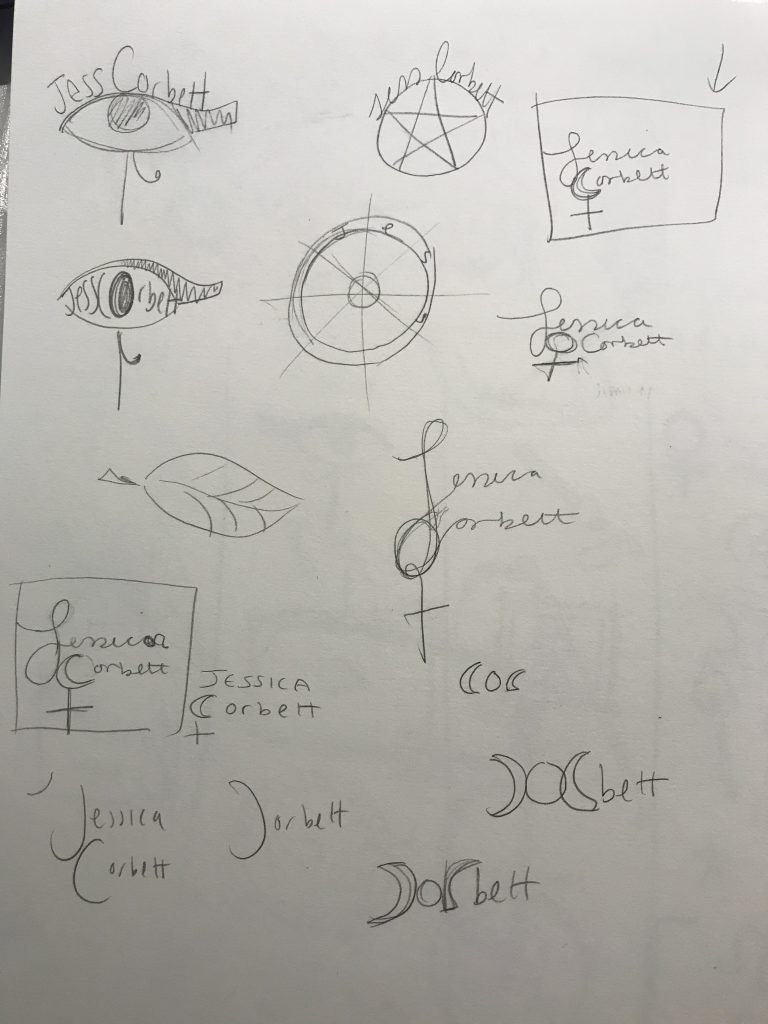
This week we were asked to create a typographical logo using our names and incorporating themes and images that reflect design influences in our life. I chose to focus on astrology and spirituality when creating my logo. I first sketched up some ideas.

I gathered ideas of things that I could incorporate into my logo. I had the most ideas for the religion and myth section. I had trouble coming up with ideas straight from my head and found it easier to just sketch until something came to mind.

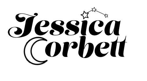
Then I realised that I could incorporate a crescent moon into my last name on the capital C. The moon and stars are an important aspect of my religion and one of the main symbols this is why I chose to focus on this. I also thought of adding the female symbol on to the bottom of the moon which is another symbol that appears a lot in paganism (symbolising the goddess), this idea was later omitted. I chose the font ‘Lust Script’ from adobe fonts to create my logo as I like the illustrative forms. I chose a more calligraphic, handwritten like font as it seems more natural and timeless (like the practise of paganism and astrology)

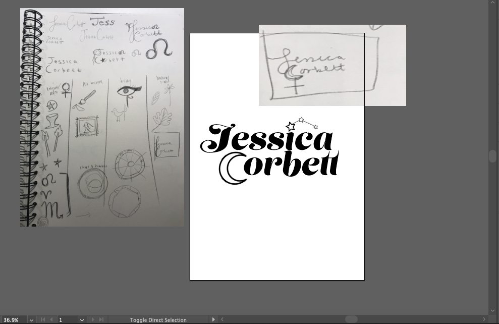
Using my notes that I uploaded into illustrator I found I could take the dot above the I away and replace it with a star constellation which are play an important role in the reading of birth charts. After this discovery the addition of the female sign was too much and didn’t really fit the theme so I took it out all together.

Overall I am happy with how my logo turned out, I did struggle somewhat coming up with ideas and executing them efficiently but I am happy with the end result.